The Single Page Settings section allows you to customize individual post pages on your site. It offers global controls while allowing specific overrides for unique posts. The settings are divided into tabs for layout, typography, and more, giving you flexibility in managing your post design.
General Settings
This tab lets you configure global settings for single post pages. These settings provide overall control but can be overridden on individual posts if needed.
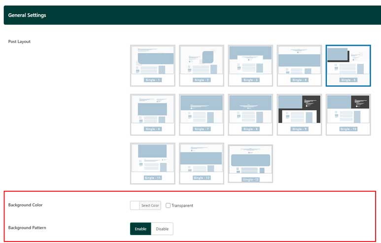
- Post Layout: Choose from 13 available layouts for displaying single posts. This setting applies globally but can be overridden by selecting a specific layout in the individual post settings.
- Dependent Options Based on Post Layout: As highlighted in the red rectangle of the image above, additional options related to background or pattern settings may appear based on the selected layout. These settings offer further customization depending on each article’s content. Since they are context-dependent and easy to manage, they are not detailed here. For any questions or further assistance, please contact our support team.
Single Page Sidebar
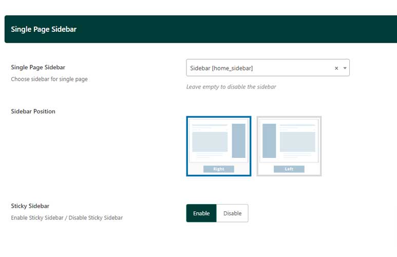
The Single Page Sidebar tab allows you to customize the sidebar settings for individual post pages. The following fields are available:
- Single Page Sidebar: Select a sidebar to display on single post pages. This can be a custom sidebar or a default one, depending on your site’s setup.
- Sidebar Position: Choose whether the sidebar should be positioned on the left or right side of the page.
- Sticky Sidebar: Enable or disable the sticky sidebar feature, which keeps the sidebar visible as users scroll down the page.
These options provide control over the placement and behavior of the sidebar, ensuring a better user experience tailored to your content layout.
Single Page Reading Percentage Progress:

This tab lets you display a reading progress indicator on individual post pages. The following fields are available:
- Single Page Reading Percentage: Toggle this option on or off to enable or disable the reading percentage progress feature.
- Single Reading Percentage Style: Choose how the reading progress is displayed:
- Bookmark Button Inside: The progress is shown bookmark button inside the percentage process circle.
- Percentage Inside: The exact percentage is displayed inside a progress cirle.
- Reading Percentage Progress Type: Select how the reading progress is calculated:
- A Whole Page (0-100%): The progress is based on the entire page content.
- Post Content Section (0-100%): The progress is calculated only within the post content section.
These settings help enhance the reading experience by giving users visual feedback on their progress through the content.
Reaction Section
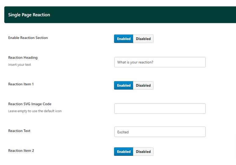
The Reaction Section allows users to interact with posts. The following fields are available:
- Enable Reaction Section: Toggle this option on or off to display or hide the reaction section.
- Reaction Heading: Set the heading text for the reaction section. The default is “What is your reaction?”
For each of the five reaction icons, the following fields are available:
- Reaction Item: Enable or disable the specific reaction item.
- Reaction SVG Image Code: Input the SVG code for a custom reaction icon. Leave this field empty to use the default icon.
- Reaction Text: Set the text label for the reaction (e.g., “Like,” “Excited,” “Happy,” “Sad,” etc.).
These settings provide flexibility in customizing the reaction options, allowing for tailored engagement based on the content type and audience preferences.
Social Share Section

The Social Share Section allows you to manage social media sharing options for your articles. You can enable or disable up to 14 social share items. The available fields are:
- Enable Share Box: Toggle this to show or hide the share box on your articles.
- For each social media platform, you can enable or disable the share link:
- Telegram
- Vkontakte
- Teams
- Hacker News
- Line
- Enable Sticky Sidebar: Toggle to enable or disable the sticky feature for the social share sidebar.
Single Page Sections
This section provides options to customize the appearance and functionality of individual posts or pages.
-
Single Page Sections On/Off
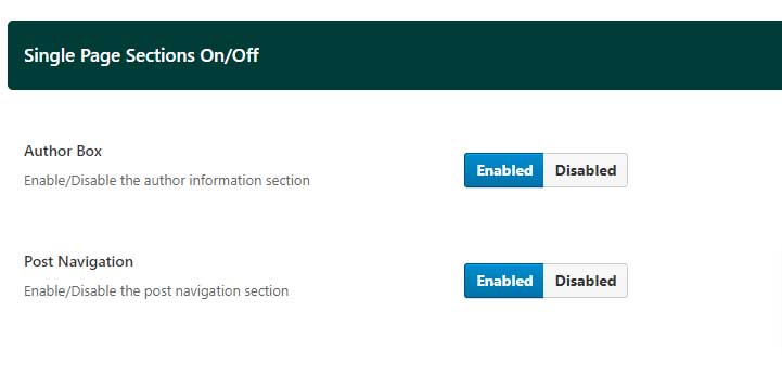
- Author Box: Toggle this option to enable or disable the author box on single pages. The author box displays information about the author of the post.
- Post Navigation: Toggle this option to enable or disable the post navigation feature. This allows users to navigate between previous and next posts within the single post view.
-
Related Posts Section
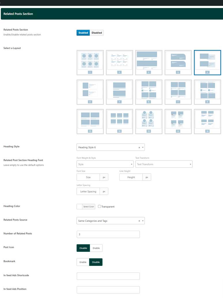
This section allows you to configure how related posts are displayed on single pages.
- Related Posts Section: Toggle to enable or disable the related posts section. This section displays a selection of posts related to the current post.
- Select a Layout: Choose from 15 different layout options for displaying related posts. This provides flexibility in how related content is presented. Please refer the demo page here to see all related article layouts
- Heading Style: Select a heading style for the related posts section. This choice will override the default heading style settings, allowing you to tailor the appearance specifically for related posts. Please refer the demo page here to see how each heading style perform
- Related Post Section Heading Font: Customize the font used for the heading in the related posts section. This setting overrides the typography settings defined in the Module Heading Styles.
- Heading Color: Use the color picker to select a custom color for the heading in the related posts section. This setting overrides the default heading color settings.
- Related Posts Source: Choose the criteria for selecting related posts:
- Same Categories and Tags: Displays posts that share the same categories and tags as the current post.
- Same Tags: Displays posts that share the same tags.
- Same Categories: Displays posts from the same categories.
- Same Author: Displays posts written by the same author.
- Number of Related Posts: Enter the number of related posts to display in this section.
- Post Icon: Toggle this option to enable or disable the display of an icon next to each related post.
- Bookmark: Toggle this option to enable or disable the bookmark feature, allowing users to bookmark related posts.
- In-feed Ads Shortcode: Enter a shortcode to insert an advertisement within the related posts feed. This shortcode can be generated from the Ad Management section in Theme Options.
- In-feed Ads Position: Specify the position within the related posts list where the advertisement should be inserted. For example, setting this to “3” will insert the ad after the third post in the list. Refer to the demo page for a visual example.
-
Comments Heading Styles
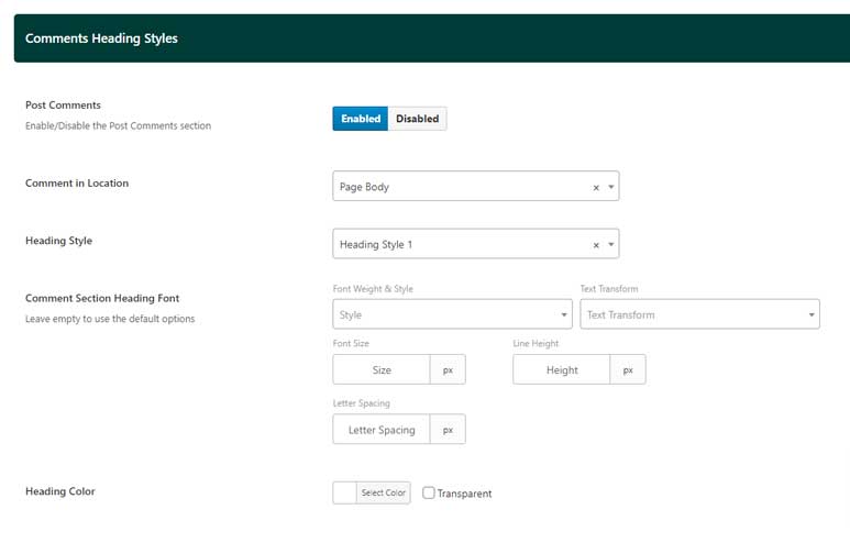
This section allows you to customize the appearance of the comments section on single pages.
-
- Post Comments: Toggle this option to enable or disable the comments section on single pages.
- Comment in Location: Choose where the comments section should be displayed:
- Page Body: The comments section will appear at the bottom of the post content.
- Magic Island Panel: The comments section will appear in a Dynamic Island panel.
- Heading Style: Select a heading style for the comments section. This option overrides the default heading style settings, allowing for customized appearance specifically for the comments section.
- Comment Section Heading Font: Customize the font used for the heading in the comments section. This setting overrides the typography settings defined in the Module Heading Styles.
- Heading Color: Use the color picker to select a custom color for the heading in the comments section. This setting overrides the default heading color settings.
Table of Contents
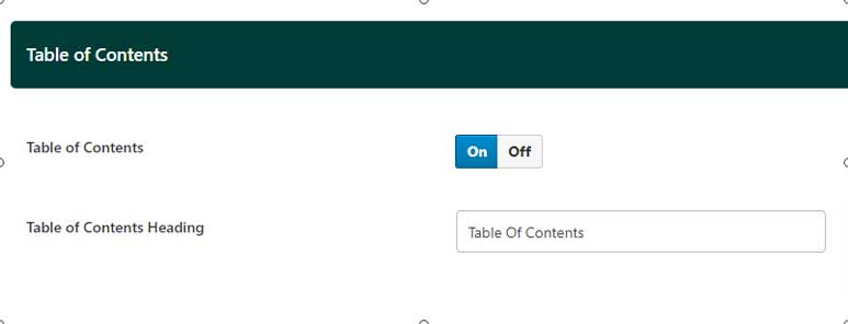
This section allows you to add a Table of Contents (TOC) to your posts, providing a quick and easy way for readers to navigate through the content.
- Table of Contents: Toggle this option to enable or disable the Table of Contents feature on your posts. When enabled, a TOC will automatically be generated based on the headings within the post.
- Table of Contents Heading: Use this text field to enter a custom heading for the Table of Contents section. This heading will be displayed above the TOC, guiding readers to navigate the content efficiently.
Color of the Reviews Score
This section allows you to customize the colors used for different ranges of review scores on your site. This feature helps visually differentiate between various levels of reviews, making it easier for users to interpret scores at a glance.
Review Score Color Ranges
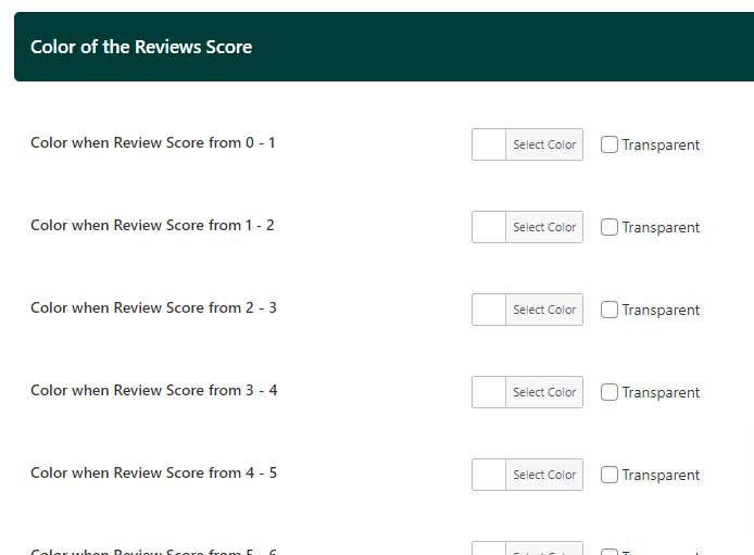
For each score range, use the color picker to set a specific color. The available ranges and corresponding color picker fields are:
- Score Range 0-1: Select a color for reviews with scores between 0 and 1.
- Score Range 1-2: Select a color for reviews with scores between 1 and 2.
- Score Range 2-3: Select a color for reviews with scores between 2 and 3.
- Score Range 3-4: Select a color for reviews with scores between 3 and 4.
- Score Range 4-5: Select a color for reviews with scores between 4 and 5.
- Score Range 5-6: Select a color for reviews with scores between 5 and 6.
- Score Range 6-7: Select a color for reviews with scores between 6 and 7.
- Score Range 7-8: Select a color for reviews with scores between 7 and 8.
- Score Range 8-9: Select a color for reviews with scores between 8 and 9.
- Score Range 9-10: Select a color for reviews with scores between 9 and 10.
These settings allow you to apply a visual gradient or distinct colors for different score levels, helping users quickly assess the quality of reviews.
Reader Review
This section allows you to configure the settings related to reader reviews, including customization of the review box and the thank you popup that appears after a review is submitted.
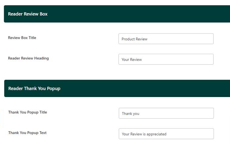
- Reader Review Box
- Review Box Title: Use this text field to enter a custom title for the reader review box. This title will be displayed prominently at the top of the review box where users can submit their reviews.
- Reader Review Heading: Enter a heading for the reader review section. This heading will be displayed above the review input fields, guiding users as they submit their reviews.
- Reader Thank You Popup
After a user submits a review, a thank you popup will appear. The following fields allow you to customize the content of this popup:
-
- Thank You Popup Title: Use this text field to enter a custom title for the thank you popup. This title will be displayed at the top of the popup, acknowledging the user’s submission.
- Thank You Popup Text: Enter the message that will be shown to users after they submit their review. This text can express gratitude and inform them that their review has been successfully recorded.
Inline Related Posts
This section allows you to configure how and where related posts are displayed within the content of your posts, helping to keep readers engaged by suggesting additional content as they read.

Inline Related Posts Settings
- Inline Related Posts Paragraph Placement: This setting allows you to choose after which paragraph the inline related posts will appear within the content. Enter a specific paragraph number to determine the placement. For example, setting this to “3” will display the related posts after the third paragraph. If you set this value to “0,” the inline related posts feature will be disabled.
- Number of Related Posts: Specify the number of related posts that should be displayed in the inline related posts box.
- Insert Post IDs: Enter the IDs of the posts you want to display as related posts in this section. Separate each ID with a comma. For example, entering “12, 8, 30, 42” will display these specific posts as related content. If you type “All,” the related posts will be displayed across all posts on your site.
- Background: Use the color picker to choose a background color for the inline related posts box. This allows you to match the box with your site’s overall design or make it stand out.
- Text Color: Use the color picker to select a color for the text within the inline related posts box. This setting ensures that the text is readable and visually consistent with your theme’s design.