The Header Settings Panel allows users to customize the appearance and functionality of the header across the site. It is divided into various sub-sections as shown below:
Header Style
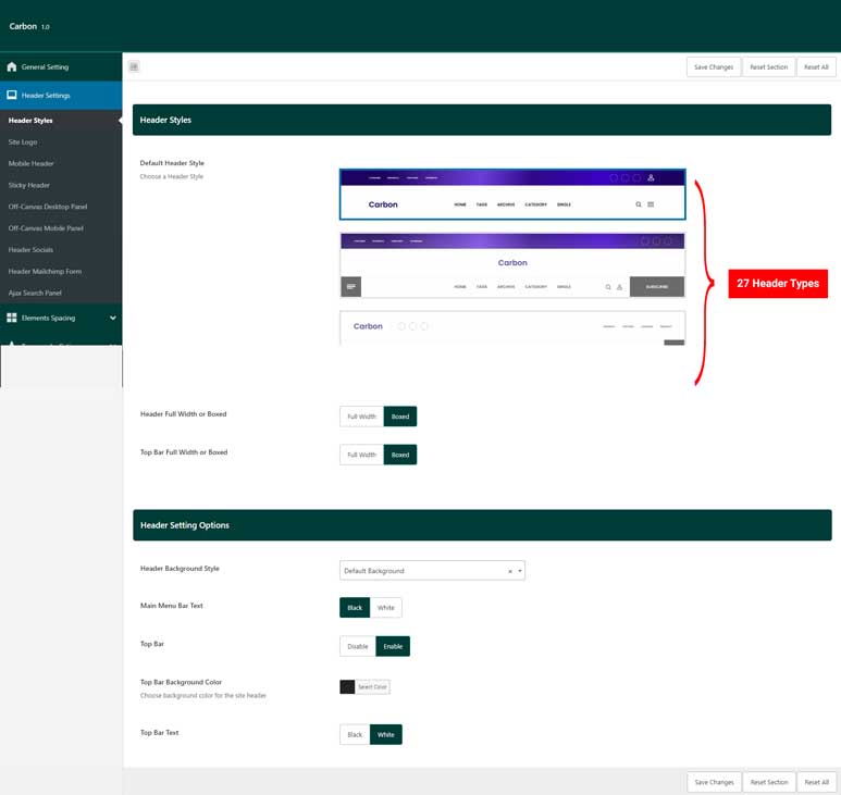
- Header Style SettingsThis section provides options to select from 27 different header styles. Depending on the selected header style, additional dependent settings become available, such as:
- Header Full Width or Boxed:
Select whether the header should span the full width of the screen or be contained within a boxed layout. - Top Bar Full Width or Boxed:
Configure whether the top bar stretches across the full width of the screen or is contained within a boxed layout.Detailed Header Settings Options
- Header Full Width or Boxed:
- Header Setting Options
Once the header style is chosen, you can proceed to fine-tune the settings using the following options:
- Header Background Style
This options allows you to choose the background style for your header. Options include:- Default Background: Use the default background style.
- Background Image: Set an image as the header background.
- Background Gradient: Apply a gradient background.
- Background Color: Set a solid color as the background.
- Main Menu Bar Text Color
Select whether the text in the main menu bar should be displayed in black or white. - Offcanvas Menu Button Background Color
Choose a color for the offcanvas menu button background using the color picker field. - Top Bar Options: Toggle the top bar on or off.
- Current Date: Option to display today’s date in the top bar.
- Top Bar Background Color: Select a background color for the top bar using the color picker field.
- Top Bar Text Color: Choose between black or white for the top bar text color.
Site Logo
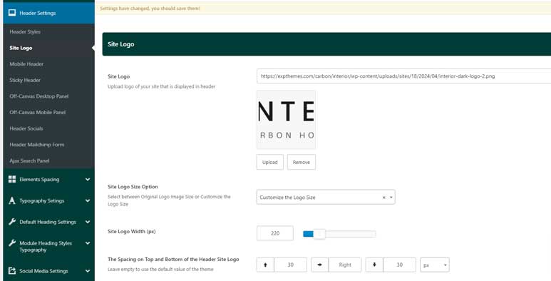
The following fields are available for configuring the site logo:
- Site Logo
This field allows you to upload the main logo for your site. You can choose any image that represents your brand or site identity. - Site Logo Size Option
You can select between two size options for the logo:- Original Logo Image Size: The logo will be displayed in its original dimensions.
- Customize the Logo Size: If selected, an additional field called Site Logo Width (px) will appear, allowing you to specify the desired width for the logo. The logo’s height will adjust automatically to maintain its aspect ratio.
Site Logo Width (px) (Visible when “Customize the Logo Size” is selected)
This field allows you to manually set the width of the logo in pixels. The height will be automatically calculated to preserve the original proportions of the image.
- Spacing on Top, Right and Bottom of the Header Site Logo
These fields allow you to adjust the top and bottom margins for the logo, giving you control over the spacing around it. You can set custom values for:- Margin Top (px)
- Margin Right (px)
- Margin Bottom (px)
These options help you fine-tune the logo placement for a balanced header design.
Mobile Header
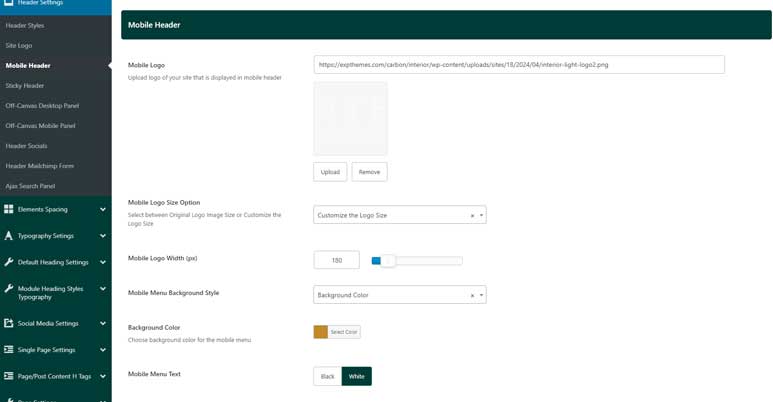
The following fields are available for customizing the mobile header:
- Mobile Logo
This field allows you to upload a separate logo specifically for the mobile version of your site. You can choose a logo optimized for smaller screens to ensure it displays clearly on mobile devices. - Mobile Logo Size Option
Similar to the desktop logo settings, you can select between:- Original Logo Image Size: The mobile logo will be displayed in its original dimensions.
- Customize the Logo Size: If this option is selected, an additional field called Mobile Logo Width (px) will appear, allowing you to specify the desired width for the mobile logo. The height will automatically adjust to maintain the logo’s aspect ratio.
Mobile Logo Width (px) (Visible when “Customize the Logo Size” is selected)
This field allows you to manually set the width of the mobile logo in pixels. The height will be adjusted automatically to preserve the original proportions.
- Mobile Menu Background Style
This dropdown allows you to choose the style of the background for your mobile menu. The available options are:- Default Background: Use the standard background style.
- Background Gradient: Apply a gradient to the background for a more dynamic look.
- Background Color: Choose a solid color for the mobile menu background.
- Mobile Menu Text
Choose whether the text within the mobile menu is displayed in black or white. This setting ensures the menu text contrasts well with your chosen background style.
Sticky Header
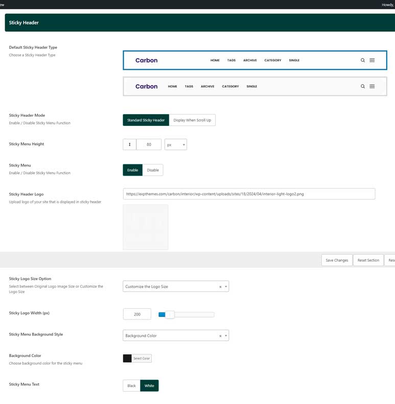
This section provides options to customize how your sticky header behaves and looks as users navigate your site. The following fields are available:
- Sticky Menu: Toggle to enable or disable the sticky menu. When enabled, the menu sticks to the top of the page as users scroll.
- Default Sticky Header Type: Choose between two sticky header designs, depending on the style you prefer:
- Sticky Header Mode: Select how the sticky header behaves as users scroll:
- Standard Sticky Header: The header remains visible whether the user scrolls up or down.
- Display When Scroll Up: The sticky header only appears when the user scrolls up and hides when scrolling down.
- Sticky Menu Height: Input a custom height for the sticky menu, allowing you to fine-tune the size of the header.
- Sticky Header Logo: Upload or select a specific logo to be displayed in the sticky header. This can be different from your primary site logo.
- Sticky Logo Size Option: Similar to other logo settings, you can choose between:
- Original Logo Image Size: Use the logo at its default dimensions.
- Customize the Logo Size: An additional option will appear to set a specific width.
Sticky Logo Width (px): If you choose to customize the logo size, specify the logo width in pixels here. The height adjusts automatically based on the width.
- Sticky Menu Background Style: Customize the background style for the sticky menu:
- Default Background: Retains the default background style.
- Background Gradient: Apply a gradient background to the sticky header.
- Background Color: Choose a specific color for the sticky header background using the color picker.
- Sticky Menu Text: Select whether the text within the sticky menu is displayed in black or white, ensuring it remains readable against your chosen background style.
This configuration allows you to create a visually appealing and user-friendly sticky header that matches the style and functionality needs of your website.
Off-Canvas Desktop Panel
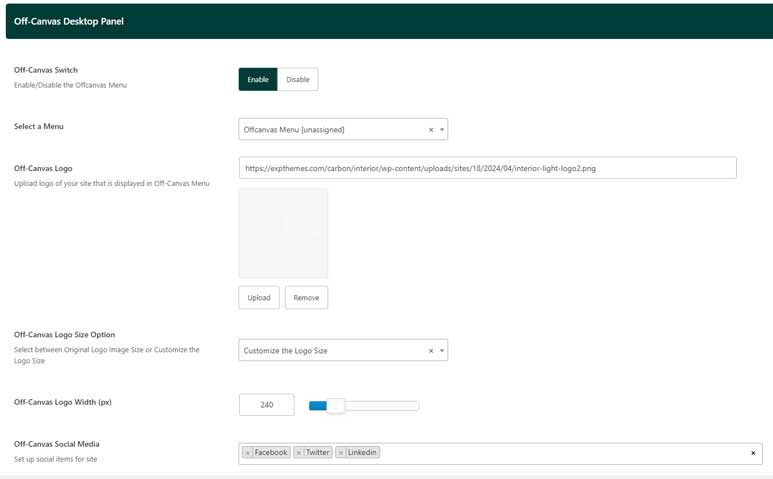
This section allows you to configure the off-canvas panel that appears on desktop devices. This panel is typically used for side menus or additional content that can be accessed via a toggle. The following fields are available:
- Off-Canvas Switch: Enable or disable the off-canvas panel. When enabled, the panel can be activated on desktop devices by a button or icon.
- Select a Menu: Choose the menu to be displayed in the off-canvas panel. This allows you to have a separate menu or extend the functionality of your primary menu.
- Off-Canvas Logo: Upload or select a logo to be displayed within the off-canvas panel. This can be different from your main site logo, allowing for brand consistency in this alternate navigation area.
- Off-Canvas Logo Size Option: Choose between:
- Original Logo Image Size: Displays the logo at its default dimensions.
- Customize the Logo Size: Selecting this option reveals an additional setting for customizing the logo width.
Off-Canvas Logo Width (px): If you selected the ‘Customize the Logo Size’ option, this field appears, allowing you to define a specific width in pixels for the off-canvas logo. The height is automatically adjusted based on the width.
- Off-Canvas Social Media Items: Add social media icons to the off-canvas panel. You can configure the icons and their links to help visitors easily find and engage with your social profiles.
This setup gives you the flexibility to design a dynamic off-canvas panel that complements your overall website structure while offering additional content or navigation options for your users.
Off-Canvas Mobile Panel
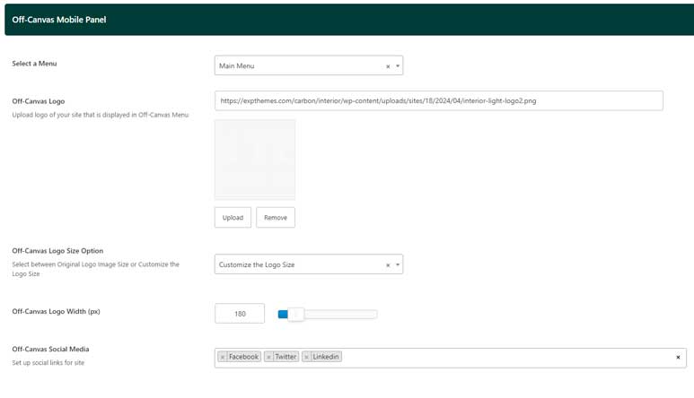
This section allows you to customize the off-canvas panel specifically for mobile devices. The panel provides a convenient way to display menus and other content in a slide-out format. The following fields are available:
- Select a Menu: Choose the menu to be displayed in the off-canvas panel on mobile devices. This menu can be customized separately from the desktop off-canvas menu.
- Off-Canvas Logo: Upload or select a logo that will be displayed within the mobile off-canvas panel. This logo can be optimized for smaller screens.
- Off-Canvas Logo Size Option: Choose between:
- Original Logo Image Size: Displays the logo at its default dimensions.
- Customize the Logo Size: If selected, an additional field will appear for customizing the logo width.
Off-Canvas Logo Width (px): If you selected the ‘Customize the Logo Size’ option, this field allows you to define a specific width in pixels for the off-canvas logo on mobile devices. The height will be automatically adjusted based on the specified width.
- Off-Canvas Social Media Items: Add social media icons to the off-canvas panel, ensuring your visitors can quickly access and engage with your social media profiles while using mobile devices.
This configuration provides a user-friendly and visually consistent off-canvas experience across mobile devices, allowing you to maintain brand presence while offering practical navigation
Header Socials:
This section lets you configure the social media icons displayed in your site’s header. These icons provide quick links to your social profiles, ensuring easy access for your visitors.
The details settings are in the Social Media Settings Tab of Theme Options
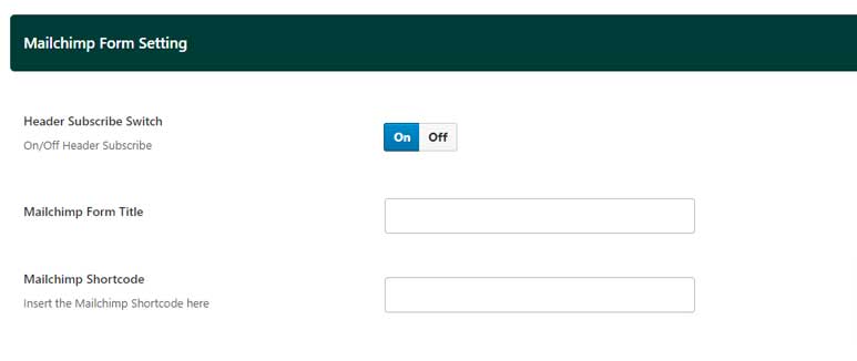
Mailchimp Form Setting
Ajax Search Panel
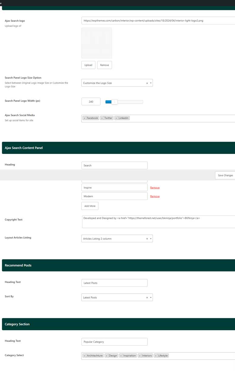
This section allows you to customize the Ajax search panel, which enhances the user experience with dynamic search results and additional content options. The following fields are available:
- Ajax Search Panel
- Ajax Search Logo: Upload or select a logo to display within the Ajax search panel.
- Search Panel Logo Size Option: Choose between:
- Original Logo Image Size: Displays the logo at its default dimensions.
- Customize the Logo Size: Selecting this option reveals an additional setting for customizing the logo width.
Search Panel Logo Width (px): If you selected the ‘Customize the Logo Size’ option, this field appears, allowing you to define a specific width in pixels for the search panel logo. The height adjusts automatically based on the width.
- Ajax Search Social Media: Add social media icons to the search panel, enabling quick access to your social profiles directly from the search interface.
- Ajax Search Content Panel
- Heading: Set a heading for the search panel using the text field.
- Keywords: Input popular keywords in this text field. These keywords can help guide users toward frequently searched topics.
- Copyright Text: Add a copyright statement or any relevant information in this text field.
- Layout Articles Listing: Select how the articles should be displayed in the search panel:
- Articles Listing 1 Column
- Articles Listing 2 Columns (default)
- Recommend Posts Section Panel
- Heading Text: Set a heading for the recommended posts section.
- Sort By: Choose how the recommended posts should be sorted:
- Latest Posts
- Popular Post by Comments
- Popular Post by Views
- Best Review
- Modified
- Alphabetical A-Z
- Alphabetical Z-A
- Category Section Panel
- Heading Text: Set a heading for the category section.
- Category Select: Choose which categories to display in this section.
This configuration provides extensive options to create a visually appealing and highly functional search experience for your visitors, guiding them to the most relevant content quickly.