
This tab allows you to configure the default styles for various headings across your site. These settings ensure a consistent appearance for headings in posts, pages, modules, and widgets. The following fields are available:
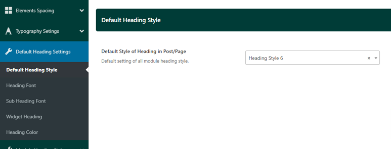
- Default Style of Heading in Post/Page: Set the default style for headings used within posts and pages. Please visit this page to see the demo of all heading styles
- Default Module Heading Typography
- Heading Font: Choose the primary font for module headings.
- Heading Inside Font: Configure the font for smaller subheadings inside modules, such as labels like “Must Read” or “Most Popular.”
-
Default Module Sub Heading: Set the typography for subheadings used within sub-modules or smaller content blocks.
- Widget Heading Typography: Define the typography for widget headings across your site. This includes widgets in the sidebar, footer, and off-canvas panels.
- Heading Color
- Module Heading Color Setting
- Main Heading: Set the color for the main headings in modules.
- Subheading: Set the color for subheadings within heading modules.
- Widget Heading Color
- Widget Heading on Sidebar: Customize the color of widget headings displayed in the sidebar.
- Widget Heading on Offcanvas Panel: Set the color for widget headings within the off-canvas panel.
- Widget Heading in Footer: Configure the color of widget headings displayed in the footer.
- Module Heading Color Setting
These settings provide granular control over the appearance of headings across your site, ensuring they remain visually consistent and aligned with your overall design style.