In this article, we will introduce the setting fields that a Carbon module has to help you easily manage your website.
Below are the setting fields supported by Carbon modules.
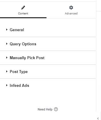
There are 5 settings tabs as shown below:
1. General Tab:
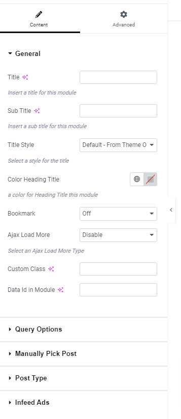
- Title Field: Use this text field to input the main heading of the module.
- Sub Title: This text field allows you to add a Sub Heading for the module.
- Title Style: Choose from a selection of pre-made styles to customize your heading.
- Heading Color: Specify a custom color for the heading to match your design preferences.
- Sub Heading Color: Select a custom color for the subheading to enhance visual appeal.
- Ajax Load More:

This feature is only available in the Listing Modules. You can choose from three Ajax Load More options for the module, as shown in the image above.
Furthermore, the theme includes a “View All Button” option, which allows you to insert a link to your desired page for easy navigation.
To see how this option works, please visit the demo page here.
- Bookmark: This option allows you to add a bookmark button to the module. This feature is available in the Listing Modules. To see how this option works, please visit the demo page here.
- Custom Class: This option is intended for development purposes. Use this field to add a specific class to the module.
- Data Id in Module: This option is designed for development purposes, allowing you to insert a
data-idHTML attribute for your module.
2. Query Options Tab
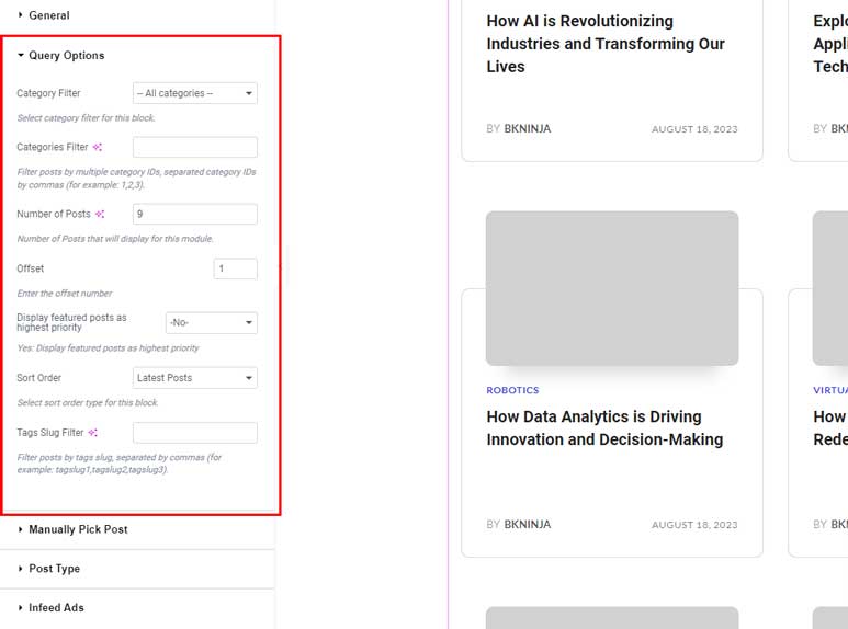
- Category Fiter:
- Description: This option allows you to select one or more categories. The module will then display posts that belong to the selected categories.
- Example: If you select “News” and “Updates”, only posts from these categories will be shown.
- Categories Filter:
- Description: This field allows you to specifically filter posts by their category IDs. You can enter multiple category IDs separated by commas.
- Example: If you enter
1, 2, 3, the module will display the posts that have the category IDs 1, 2, and 3. - Usage: This is useful when you want to showcase a specific set of posts regardless of other filters or settings.
- Number of Posts:
- Description: This field allows you to set the number of articles to display in the module.
- Example: If you enter
10, the module will show 10 posts.
- Offset:
- Description: This option skips a specified number of posts before beginning to retrieve the results. It’s useful for displaying posts starting from a specific point rather than from the beginning.
- Example: If you set the offset to
5, the module will skip the first 5 posts and start displaying from the 6th post onward.
- Display Featured Posts as Highest Priority:
- Description: When set to “Yes”, the module prioritizes featured posts and displays them first.
- Example: If enabled, featured posts will appear at the top of the list regardless of the default order.
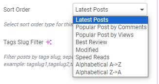
- Sort Order
- Description: This field allows you to choose how to order the articles.
- Options: Typically includes options as shown in the below image.
- Note: For detailed information on each option, please contact our support team then we can explain more.
- Tag Slug Filter:
- Description: This field allows you to specifically filter posts by their Tag IDs. You can enter multiple tag IDs separated by commas.
- Example: If you enter
1, 2, 3, the module will display the posts that have tag IDs 1, 2, and 3. - Usage: This is useful when you want to showcase a specific set of posts regardless of other filters or settings.
3. Manually Pick Posts Tab
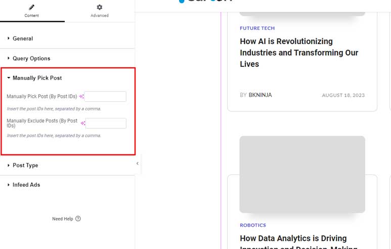
- Manually Pick Posts:
- Description: This field allows you to specifically filter posts by their post IDs. You can enter multiple post IDs separated by commas to display only those particular posts.
- Example: If you enter
1, 2, 3, the module will display the posts with IDs 1, 2, and 3. - Usage: This is useful when you want to showcase a specific set of posts regardless of other filters or settings.
- Manually Exclude Posts:
- Description: This field allows you to exclude certain posts by their post IDs. Enter the post IDs separated by commas to prevent those posts from being displayed.
- Example: If you enter
1, 2, 3, the module will not display the posts with IDs 1, 2, and 3. - Usage: This is useful when you want to ensure certain posts are not shown, even if they match other filters or settings.
4. Post Type Tab:
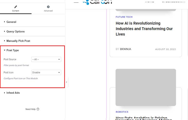
- Show only Post Type:
- Description: This field allows you to filter posts by their post type. There are three post types available for selection: Gallery, Video, and Review.
- Options:
- Gallery: Only gallery-type posts will be shown.
- Video: Only video-type posts will be shown.
- Review: Only review-type posts will be shown.
- All: By default, this option shows all post types.
- Example: If you choose “Gallery”, the module will display only the posts that are of the Gallery type.
- Post Icon:
- Description: If you enable this option, an icon representing the post type (Gallery, Video, or Review Score) will be displayed on the articles.
- Example: If a post is of the Video type, enabling this option will show a video icon on that post.
- Usage: This feature helps users quickly identify the type of content at a glance.
5. Infeed-Ads Tab:
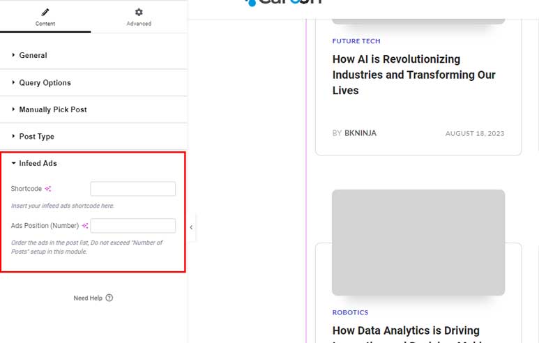
The Infeed-ads tab provides options to display ads that look like articles within the feed. These ads can be displayed responsively on various device screens.
This tab is available for the Listing Module.
To understand how this option works, you can visit the demo page here
- Shortcode:
- Description: The ads shortcode is generated through the Theme Option panel. When you create an ad, a shortcode is automatically generated.
- Usage: Use this shortcode to insert the ad into your post list.
- Reference: Check the provided video tutorial for a step-by-step guide on generating and using the shortcode.
- Ads Position:
- Description: This field allows you to specify the position of the ad within the post list.
- Example: If you set this field to
3, the ad will appear as the 3rd item in the post list.
To see all modules that supported by the Pagebuilder, please take a look at its demo here